")
Resort Hotel Association
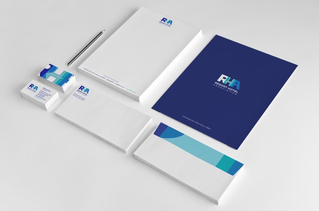
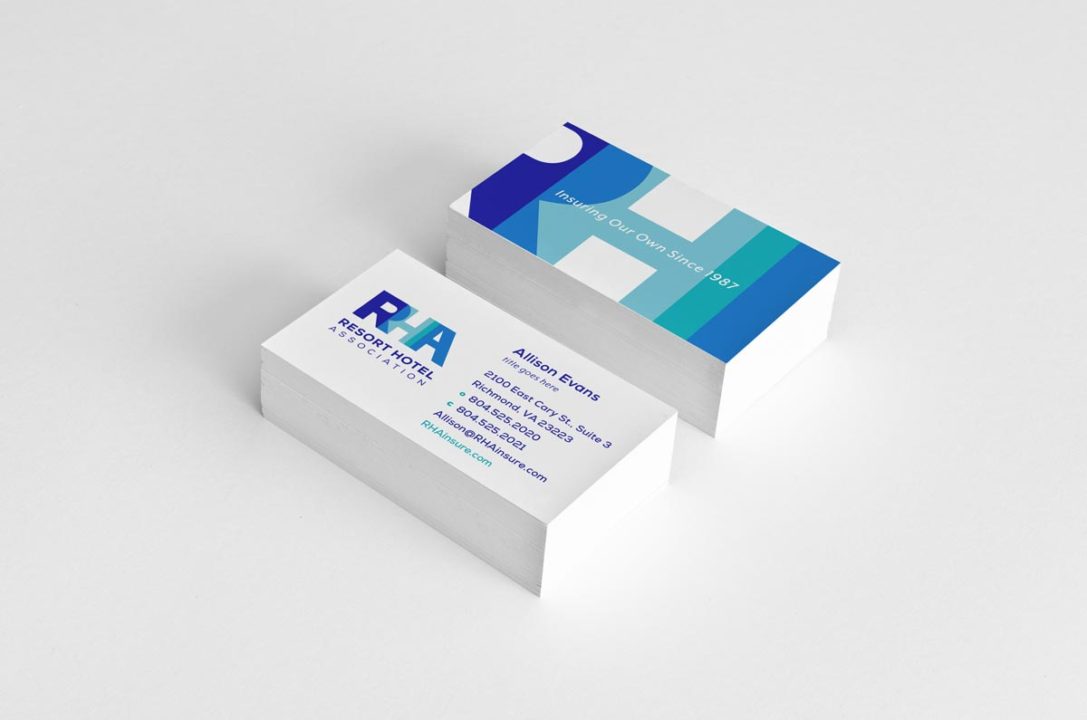
We began with an identity exploratory to refresh the brand design and language. Feeling strongly about utilizing the historic equity in the “RHA” acronym, we developed a new over-lapping type treatment that represents unity and transparency in our organization. We’ve also refreshed our brand colors to add energy and vibrancy. The new tag line we created in conjunction with the logo works to identify RHA as a member-owned insurance provider with decades of experience.
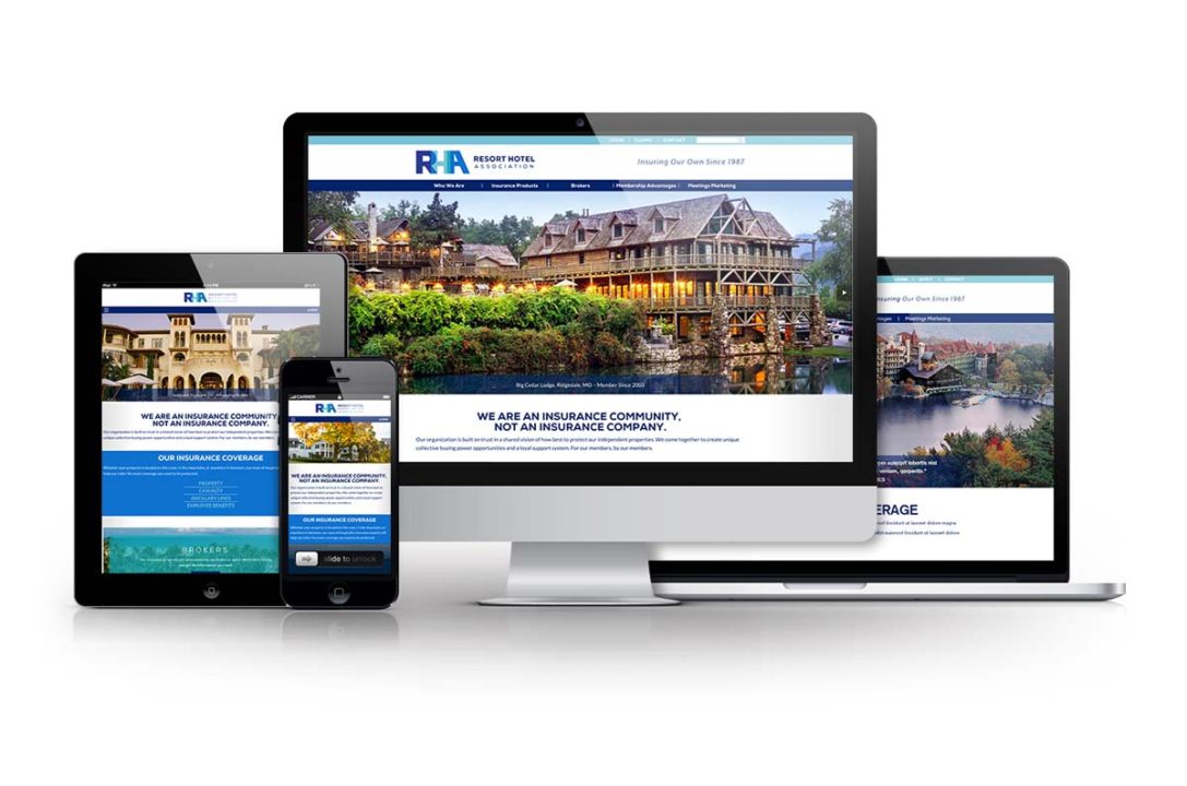
Once the identity was complete, we began working on a new website. Our goal was to modernize the RHA brand online, so we placed emphasis on our new branding, improving functionality and creating a better overall user experience. We also refined the copy to increase relevance and optimized the member and broker portals to make the site much easier to navigate and use.
Description:
Rebrand
Role:
Strategy/Design